
Energy Plots
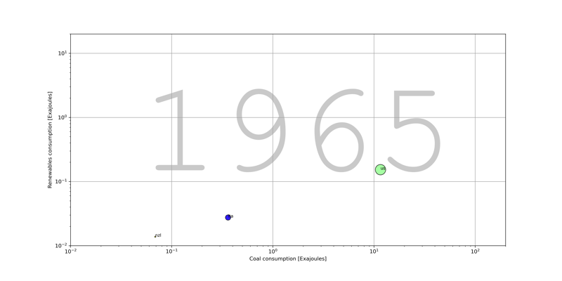
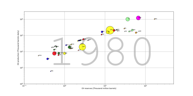
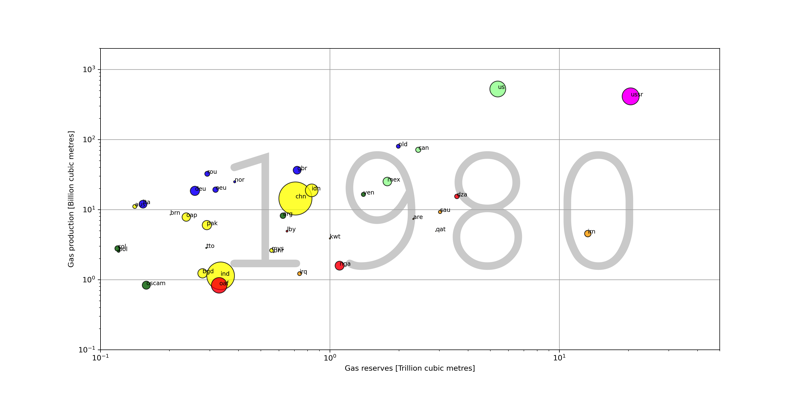
The animated bubble charts below are based on 1965-2024 energy data from the statistical review of world energy and population data from the World Bank. They were made using Python (Jupyter notebooks in this github repository).
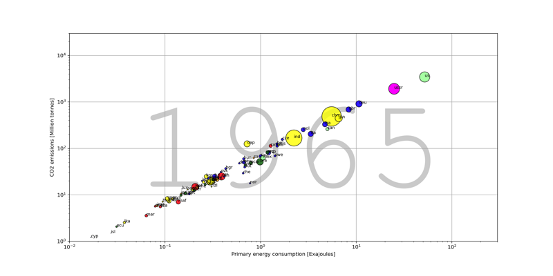
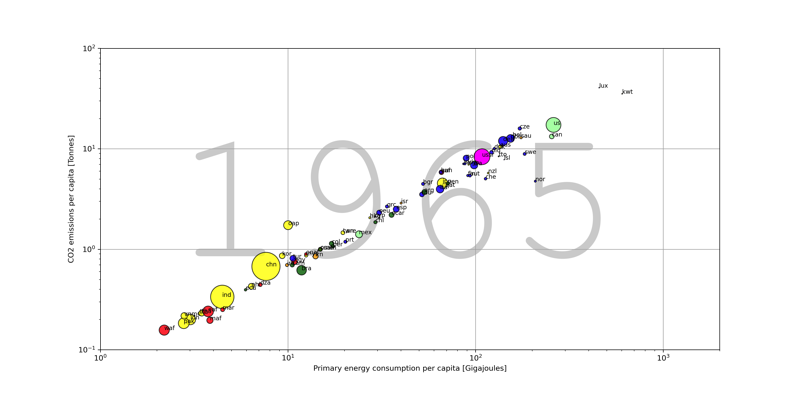
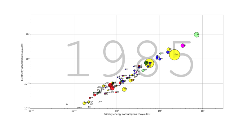
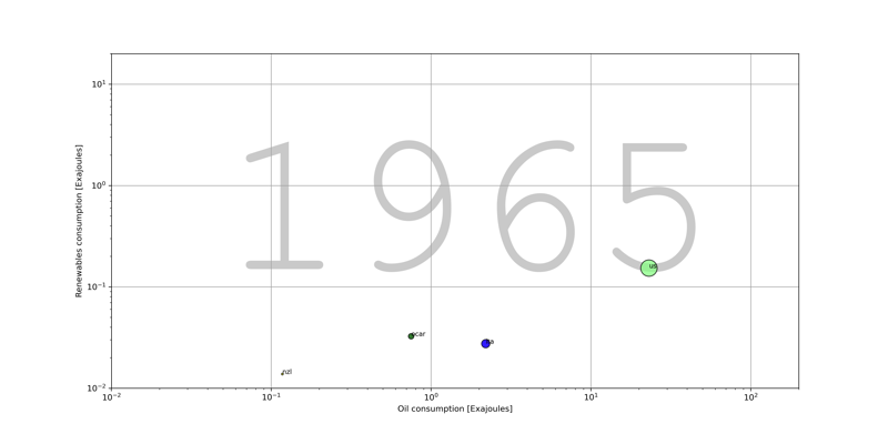
In all plots, horizontal and vertical axes are in logarithmic scale. Axes may not encompass the same range, so when comparing variables be careful with orders of magnitude. Each bubble is a country, with size representing the country’s population, and colour indicating seven world regions:
1. North America = Pale green
2. South and Central America = Dark green
3. Europe = Blue
4. CIS = Magenta
5. Middle East = Orange
6. Africa = Red
7. Asia Pacific = Yellow
Countries are also labelled using their geo-codes.
Feel free to use these movies for teaching, research and public presentations.
Primary energy consumption versus CO2 emissions (notebook):